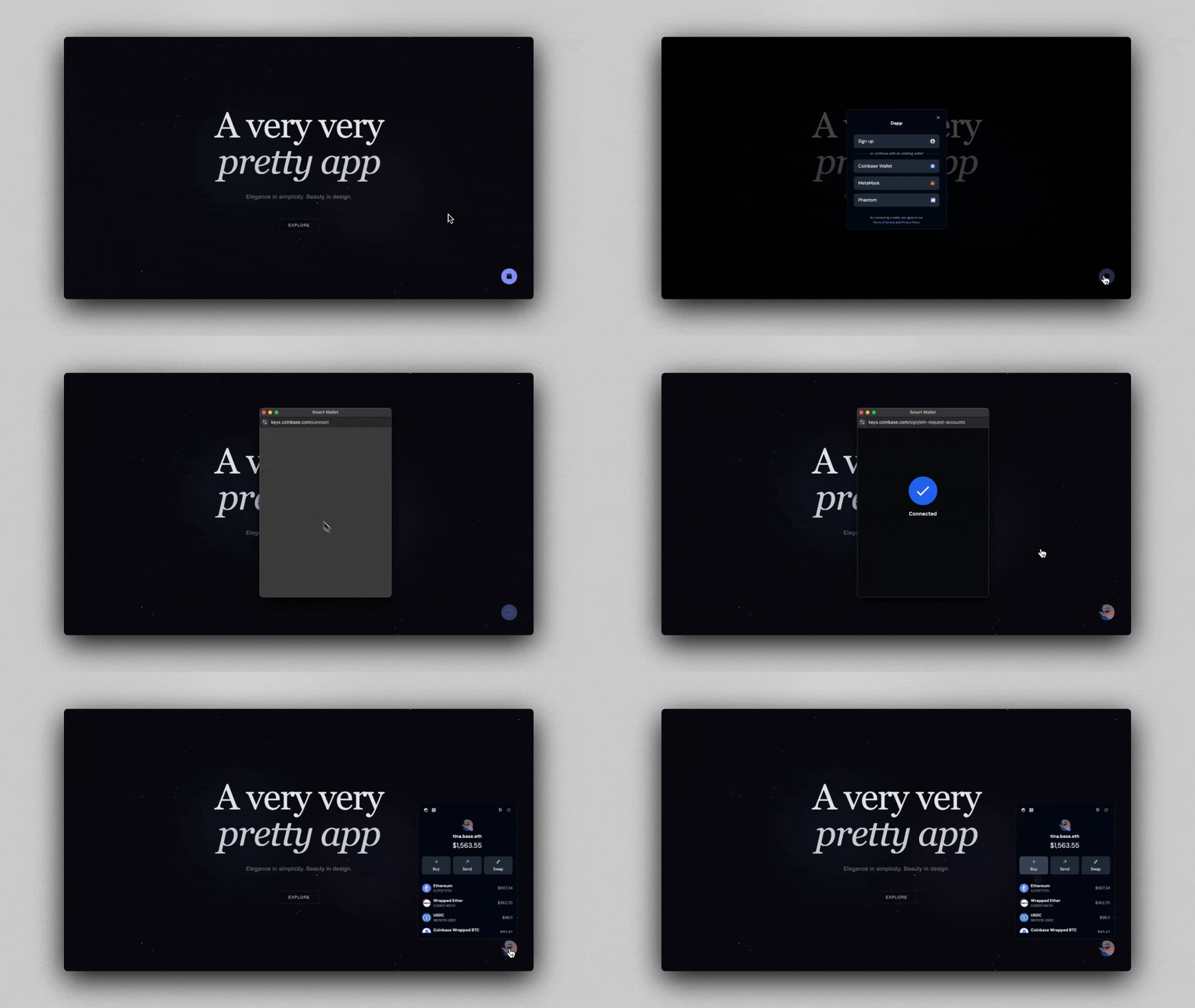
<WalletIsland />

WalletIsland is our flagship implementation of the new <WalletAdvanced />
component, providing an advanced Wallet interface for users, including:
- a QR code for receiving funds
- a link to buy crypto with fiat
- a swap interface
- the user's token portfolio
- a button that moves anywhere on the screen
Designed for desktop experiences, WalletIsland component gives
users a seamless way to interact with their wallet and manage their assets.
Before using these components, ensure you've completed all Getting Started steps.
Quick start
WalletAdvanced has two default implementations:
WalletAdvancedDefaultWalletIsland
WalletAdvancedDefault provides the user with an advanced wallet
interface, anchored to the screen like our standard Wallet component.
WalletIsland provides the same powerful interface, while enabling
the user to drag the component around the window.
If you'd like more customization, follow the implementation guide below.
import { WalletAdvancedDefault } from '@coinbase/onchainkit/wallet';
import { WalletIsland } from '@coinbase/onchainkit/wallet';
<>
<WalletAdvancedDefault />
<WalletIsland />
</>You will see two Wallet buttons below. Right below is WalletAdvancedDefault.
This version will stay anchored to its current position.
WalletIsland is in the bottom-right corner of the window. Feel free to drag
it around.
While this behavior is more noticeable with the WalletIsland component, you'll
notice that for both components, the WalletAdvanced container will appear in
different positions depending on the component's location in the window:
- If there is sufficient space to the right, it will be left-aligned.
- If there is not enough space to the right, it will be right-aligned.
- If there is enough space below, it will open below.
- If there is not enough space below, it will open above.
Configuring WalletIsland and WalletAdvanced
Experience the magic by simply dropping in <Wallet /> and <WalletAdvanced />
components, and watch your component seamlessly come to life.
As with WalletDefault , WalletAdvancedDefault leverages
several <Identity> components like <Avatar>,
<Name>, and <Address>.
And WalletAdvanced introduces several advanced wallet components, including
<WalletIslandAddressDetails>, <WalletIslandTokenHoldings>, and
<WalletIslandTransactionActions>.
import {
ConnectWallet,
Wallet,
WalletAdvanced,
WalletAdvancedAddressDetails,
WalletAdvancedTokenHoldings,
WalletAdvancedTransactionActions,
WalletAdvancedWalletActions,
} from '@coinbase/onchainkit/wallet';
import { Address, Avatar, Name, Identity } from '@coinbase/onchainkit/identity';
import { color } from '@coinbase/onchainkit/theme';
export function YourWalletAdvanced() {
return (
<div className="flex justify-end">
<Wallet>
<ConnectWallet>
<Avatar className="h-6 w-6" />
<Name />
</ConnectWallet>
<WalletAdvanced> // [!code focus]
<WalletAdvancedWalletActions /> // [!code focus]
<WalletAdvancedAddressDetails /> // [!code focus]
<WalletAdvancedTransactionActions /> // [!code focus]
<WalletAdvancedTokenHoldings /> // [!code focus]
</WalletAdvanced> // [!code focus]
</Wallet>
</div>
);
}When customizing your WalletAdvanced implementation, use the draggable prop on
Wallet to enable draggability. draggable defaults to false, but
when draggable is set to true, you can also set a draggableStartingPosition prop to
specify the initial position of your WalletIsland.
import {
ConnectWallet,
Wallet,
WalletAdvanced,
WalletAdvancedAddressDetails,
WalletAdvancedTokenHoldings,
WalletAdvancedTransactionActions,
WalletAdvancedWalletActions,
} from '@coinbase/onchainkit/wallet';
import { Address, Avatar, Name, Identity } from '@coinbase/onchainkit/identity';
import { color } from '@coinbase/onchainkit/theme';
export function DraggableWalletAdvanced() {
return (
<div className="flex justify-end">
<Wallet
draggable={true}
draggableStartingPosition={{
x: window.innerWidth - 300,
y: window.innerHeight - 100,
}}
>
<ConnectWallet>
<Avatar className="h-6 w-6" />
<Name />
</ConnectWallet>
<WalletAdvanced>
<WalletAdvancedWalletActions />
<WalletAdvancedAddressDetails />
<WalletAdvancedTransactionActions />
<WalletAdvancedTokenHoldings />
</WalletAdvanced>
</Wallet>
</div>
);
}Customize Connect button text and style
Each OnchainKit component offers the flexibility to customize className
and adjust the style of the React components it represents.
Explore the options for customizing the Connect button text and style here.
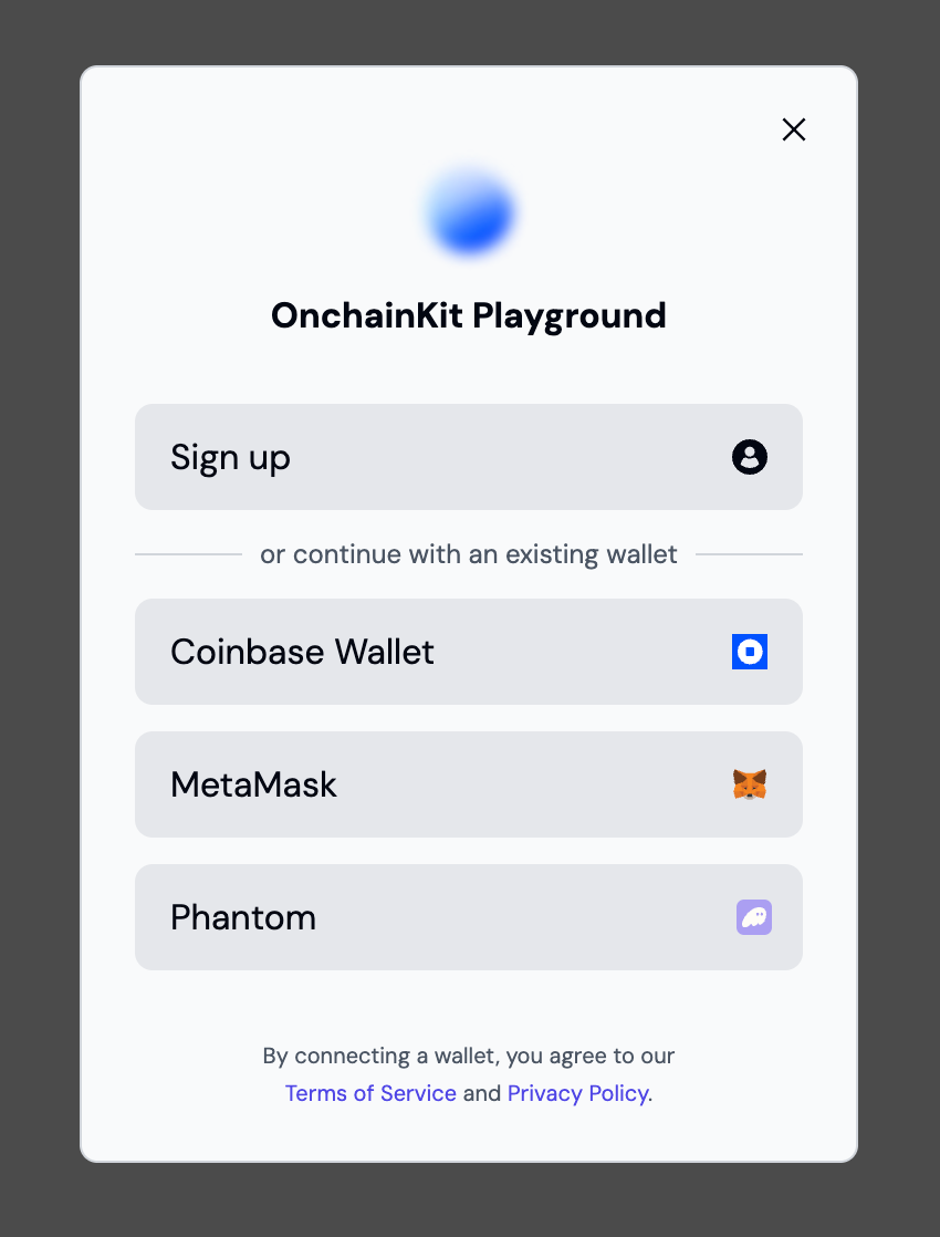
Using Wallet Modal

Wallet modal offers users multiple wallet connection options. Explore these options here.
Example usage
Usage with Sign In With Ethereum (SIWE)
To use Sign In With Ethereum (SIWE) with OnchainKit, check out our SIWE example.
Components
The components are designed to work together hierarchically. For each component, ensure the following:
<Wallet />- Serves as the main container for all wallet-related components.<WalletAdvanced />- Contains additional wallet information and options. Place inside the<Wallet />component.<WalletAdvancedWalletActions />- Provides wallet actions like View Transaction History, view QR Code, and Disconnect wallet. Place inside the<WalletAdvanced />component.<WalletAdvancedAddressDetails />- Displays user address, avatar, and portfolio balance in fiat. Place inside the<WalletAdvanced />component.<WalletAdvancedTransactionActions />- Buttons for buying crypto with fiat, transferring crypto, and swapping. Place inside the<WalletAdvanced />component.<WalletAdvancedTokenHoldings />- Displays token balances and their value in fiat. Place inside the<WalletAdvanced />component.<ConnectWallet />- Handles the wallet connection process. Place child components inside to customize the connect button appearance.<AppWithWalletModal />- Enables a wallet aggregation experience.<WalletDropdown />- Contains additional wallet information and options. Place inside the<Wallet />component.<Identity />- Displays user identity information. Place inside<WalletDropdown />for a complete profile view.<WalletDropdownBasename />- Displays the user's Basename within the dropdown.<WalletDropdownLink />- Creates a custom link within the dropdown. Use theiconprop to add an icon, andhrefto specify the destination.<WalletDropdownDisconnect />- Provides a disconnect option within the dropdown.
Additional components for customizing the wallet interface include:
<Avatar />- Displays the user's avatar image.<Name />- Shows the user's name or ENS.<Badge />- Can be used to display additional user status or information.<Address />- Shows the user's wallet address.<EthBalance />- Displays the user's ETH balance.
The Wallet component automatically handles the wallet connection state and updates the UI accordingly. You need to wrap your application or relevant part of it with these components to provide a complete wallet interaction experience.