Astro Installation
Install and configure OnchainKit with Astro. If you are integrating OnchainKit into an existing project, skip to the OnchainKit installation.
Install Astro
Create a new Astro project by using the Astro CLI. More information about Astro can be found here.
npm create astro@latestInstall React
Astro does not come with React by default, so if you are not already using React in your application, you will need to install it.
npx astro add reactInstall OnchainKit
Add OnchainKit to your project by installing the @coinbase/onchainkit package.
npm install @coinbase/onchainkitGet A Client API Key
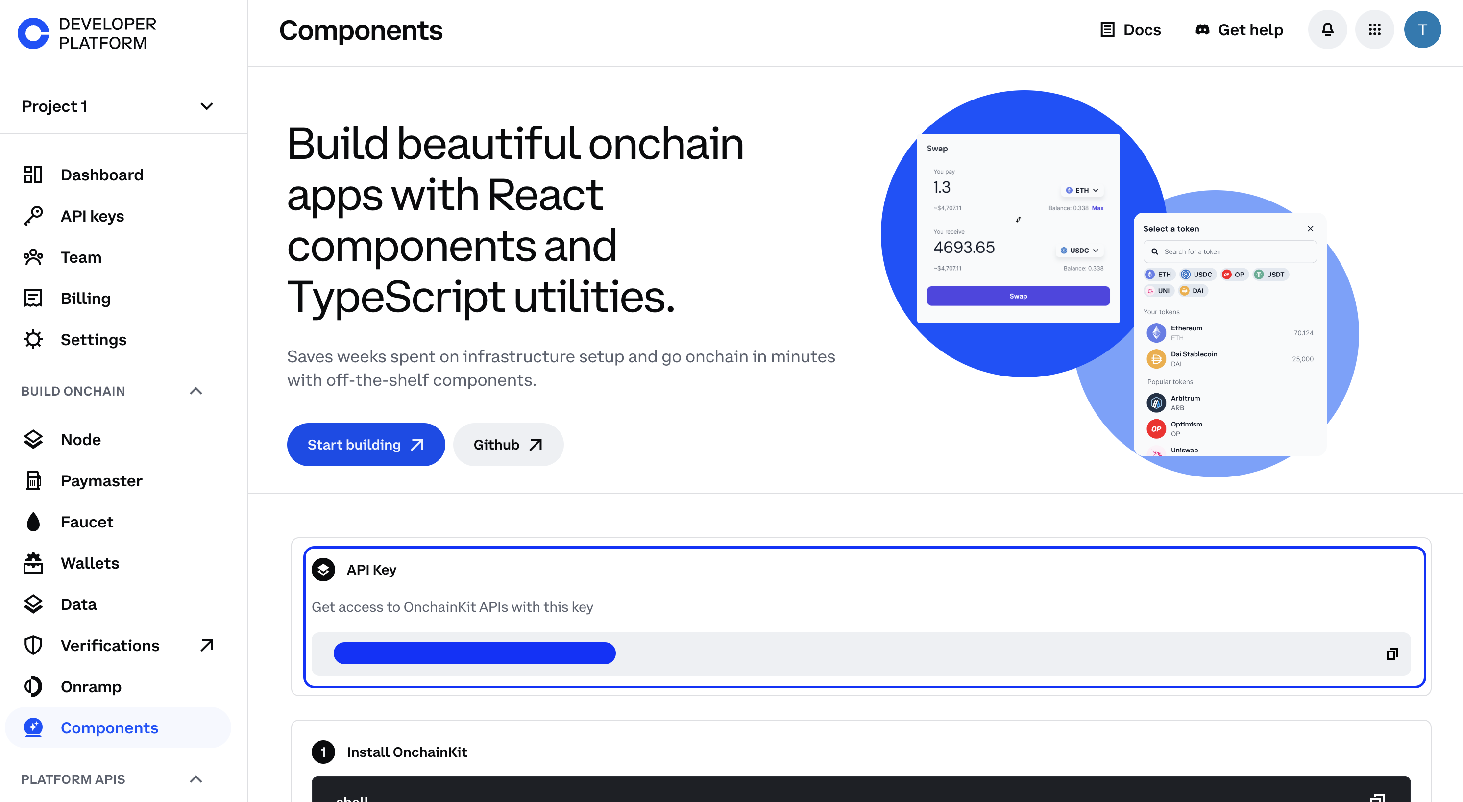
Get your Client API Key from Coinbase Developer Platform.

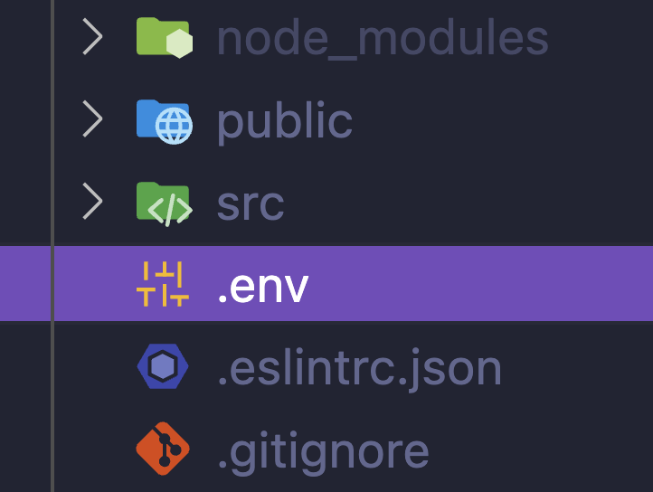
Create a .env file in your project's root directory.

Add your Client API Key to the .env file:
PUBLIC_ONCHAINKIT_API_KEY=YOUR_CLIENT_API_KEYAdd Providers
Create a providers.tsx file. Add OnchainKitProvider with your desired config.
Under the hood, OnchainKit will create our recommended Wagmi and QueryClient providers. If you wish to customize these providers, check out Custom Supplemental Providers.
'use client';
import type { ReactNode } from 'react';
import { OnchainKitProvider } from '@coinbase/onchainkit';
import { base } from 'wagmi/chains'; // add baseSepolia for testing
export function Providers(props: { children: ReactNode }) {
return (
<OnchainKitProvider
apiKey={import.meta.env.PUBLIC_ONCHAINKIT_API_KEY}
chain={base} // add baseSepolia for testing
>
{props.children}
</OnchainKitProvider>
);
}Wrap your OnchainKit components with <Providers />
After configuring the providers in step 4, you will need to wrap your OnchainKit components
with the <Providers /> component.
There are two options for this:
- Create a component, eg.
<ReactIsland />that contains all OnchainKit components. - Wrap every OnchainKit component individually.
import { Providers } from '../Providers';
export default function ReactIsland() {
return (
<Providers>
<YourReactAppContainingOnchainKitComponents />
</Providers>
);
}The advantage of ReactIsland is that you will only have a single provider at any time. The drawback is that your OnchainKit components will all need to live in the same Island.
The advantage of individual wrappers is that you can use OnchainKit components anywhere in your app. The drawback is that you will have multiple providers if you use more than one OnchainKit component.
Add OnchainKit Components to your App
You can add OnchainKit components to your app by using the component(s) you
created above into your .astro files.
For example, if you created a ReactIsland, you can add it to your
src/pages/index.astro file:
---
import Layout from '../layouts/Layout.astro';
import ReactIsland from '../components/ReactIsland';
---
<Layout title="Welcome to Astro.">
<main>
...
<ReactIsland client:only="react" />
...
</main>
</Layout>Don't forget to add the client:only="react" directive to your OnchainKit component,
as this is required for Astro to render React components.
Import OnchainKit Styles
OnchainKit components come with pre-configured styles.
To include these styles in your project, add the following import
statement at the top of the Layout.astro file:
import '@coinbase/onchainkit/styles.css';This ensures that the OnchainKit styles are loaded and applied to your entire application.
-
For Tailwind CSS users, check out our Tailwind Integration Guide.
-
Update the appearance of components by using our built-in themes or crafting your own custom theme. Explore the possibilities in our Theming Guide.
Start building!
Identity- Show Basenames, avatars, badges, and addresses.Wallet- Create or connect wallets with Connect Wallet.Transaction- Handle transactions using EOAs or Smart Wallets.Checkout- Integrate USDC checkout flows with ease.Fund- Create a funding flow to onboard users.Tokens- Search and display tokens with various components.Swap- Enable token swaps in your app.Mint- View and Mint NFTs in your app.